Overview
This case study talks about the challenged faced and thought-process that went behind Redesign of Booking Cards on Operator App in Nurture.Farm Ecosystem.
Problem Space
Business and Product Challenges identification
On an exploratory working session with the prodct team, we were able to address certain issues impacting the business operations and tech. Operators are not responding to the bookings assigned to them which is creating a bottleneck of dormant bookings in the system. So the business wants to improve the operator response rate on bookings assigned to them and inturn grow the service ecosystem to be more profitable.
Exploring Solution Space
My Approach
By the time I joined this company, a basic system of functioning for operators has been already established and the operators are used to using this app and going through booking cards to manage and do their tasks.
I took an opportunity to take a look at whole booking system as well as the functiong of operators in their day to day workday life in order to understand what works and what does not work for them through an exploratory session with them and followed simple steps as defined below to achieve a successful redesign.
Simple steps adopted while exploring this solution space are
First understand who is the user/persona and painpoints.
Why does he need these cards?
Analyse different variery of information and CTAs he needs on this card and for a group of cards.
Brainstorm, ideate and align with the product team on business challenge, OKRs/roadmap, user painpoints to define the features on this card accordingly.
What is the order of hierarchy of different information and CTAs that he consumes in order to be able to perform his tasks effiecienty.
Now compare this above knowledge obtained with the existing card design, user painpoints and analyse what works and what does not work on this current card design.
Iterate on new card design till all the above knowlege gathered is justified through simple, intutive and clean design :)

Persona
First understand who is the user/persona and find out the pain-points.
Who are Operators?
Operators are the people who operate miscellanious machines on the field of farmers at a given date and time booked by the farmer.
How does an operator’s day look like?
Morning
When he heads out of home, he checks for accepted bookings on the app and visits those respective farmers to provide services untill noon.
Meanhwhile he also does some minor tasks like maintenance of machine and refill fuel into the machine etc.
Afternoon
Operators choose to rest afternoon in general since its too hot to work on fields.
They use this time to report maintenace and fuel expenses on the app to claim reimbursements.
Sometimes they meet their manager to submit cash collections to their Field Manager and report the same on the app.
Evening
They resume field work (similar to steps mentioned in morninf section) till sun sets.
Checks out the app for new bookings and accepts or rejects bookings he would like to do tomorrow.
Generayy accepts around 4 bookings per day.
Addressed Painpoints
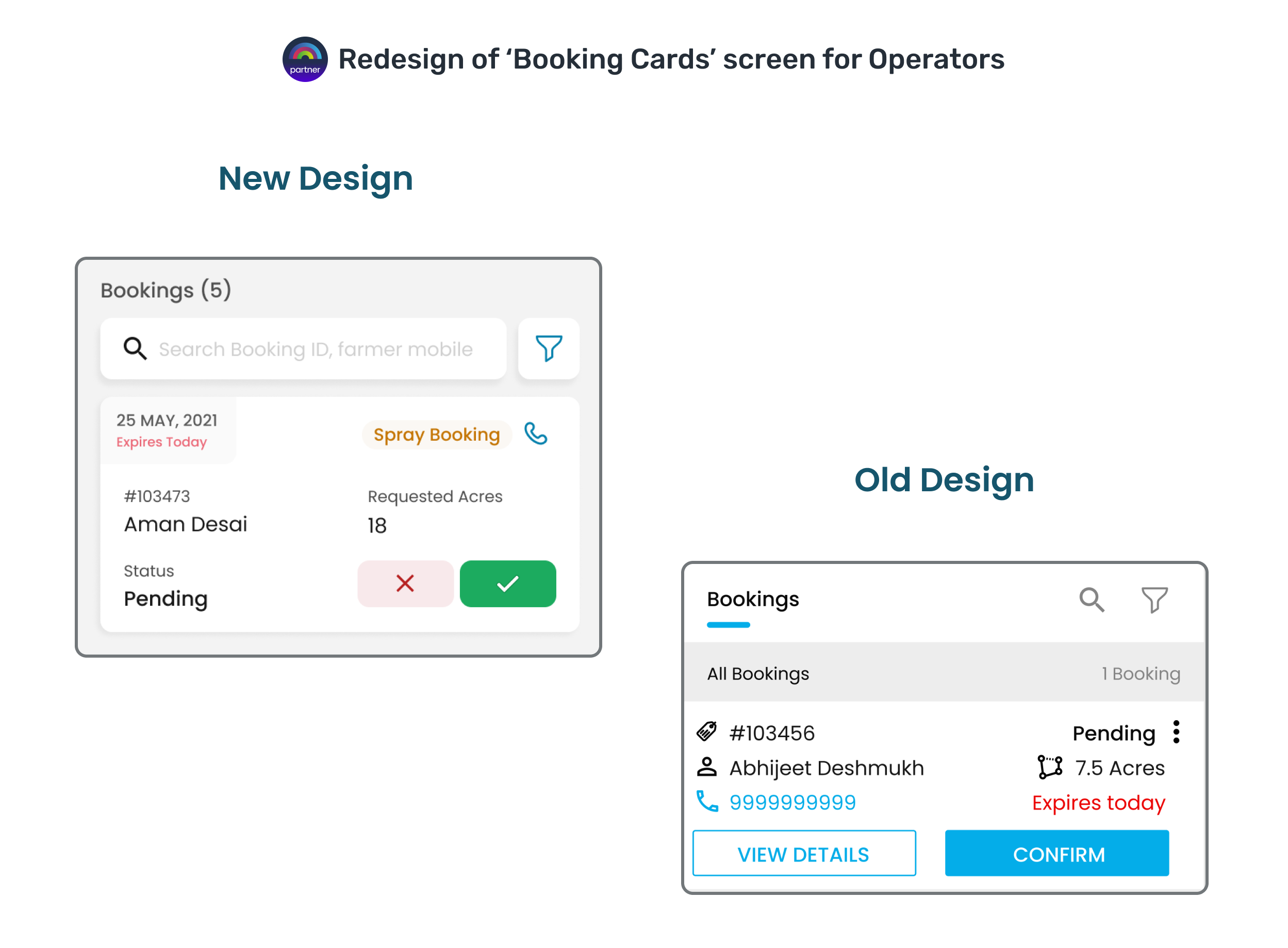
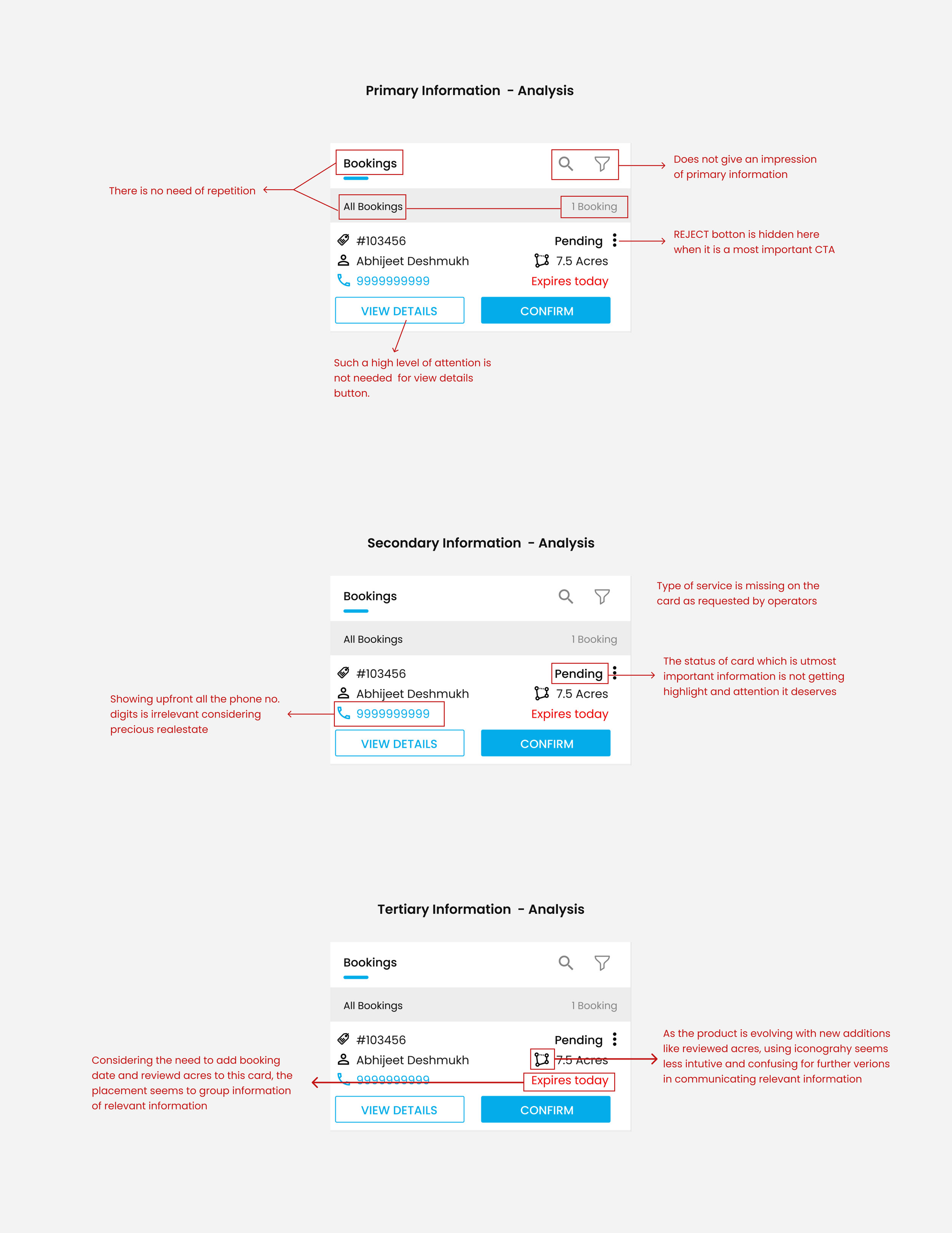
The way to reject booking is hidden somewhere inside.
Not able to see type of service the booking is for.
Not able to see the revewed acres (It is important to him because its based on reviewd acres he is gonna receive payment).
some icons are not very intutive.
Status of booking is not highlighted well.
2. Why?
Why does he need these cards?
What do these cards represent?
Each card represents a booking made by a farmer.
These cards should help the Operator in Decision Making.
They should give him an overall understanding of how to prioritize the bookings before visiting farmers.
3. Information Analysis
Analyse different variery of information and CTAs he needs on this card and for a group of cards.
Actions needed for set of Cards :
Search Bookings
Filter Bookings
All Information on Card :
Booking ID
Farmer Name
No. of Acres booked by farmer for service
Phone no. of Farmer
No. of Acres verified/Reviewed as serviced.
Actions needed on a Card :
Accept Booking
Reject Booking
Start Service
Resume Service
Stop Service
4. Integrate business challenges
Brainstorm, ideate and align with the product team on business challenge, OKRs/roadmap, user painpoints to define the features on this card accordingly.
New additions to card
Introduce ‘type of booking’ tags ie differentiate between service types.
Show acres reviewed by Field officer
Show Reviewed Acres
5. Information Hierarchy
What is the order of hierarchy of different information and CTAs that he consumes in order to be able to perform his tasks effiecienty.
How to determine Hierarchy?
To be able to determine hierarchy on information and actions on Cards, lets first understand how an operator absorbs this information and the tasks he performs.
Order of Tasks done per booking :
Apply filters and get cards in PENDING status or search based on farmer name or mobile no.
*PENDING status - booking that were neither accepted nor rejected by operators
Call the farmers to confirm and fix arrival time
Accept the booking booking if farmer is available and all the chemicals are bought and ready at the farm.
Operator Rejects booking when farmer is not ready with chemicals or he is unavailable. He also might cancel
Start Spray - the machine starts spraying the chemical by moving on field.
Pause or Stop Spray.
Now based on this order of tasks lets categorise the hierarchy of information.

Primary Information
Search and Filter takes highest prominence.
All the CTAs Accept, Reject, Start, Resume, Stop
Date of Service request and expiry days
Secondary Information
Call function takes next importance because operators confirm the booking based on farmer’s availability.
The ‘type of Service’ Should also get enough attention
Status of Booking
Teritiary Information
All the details and information like booking ID, farmer anme, Acres etc will take least prominence on the cards.
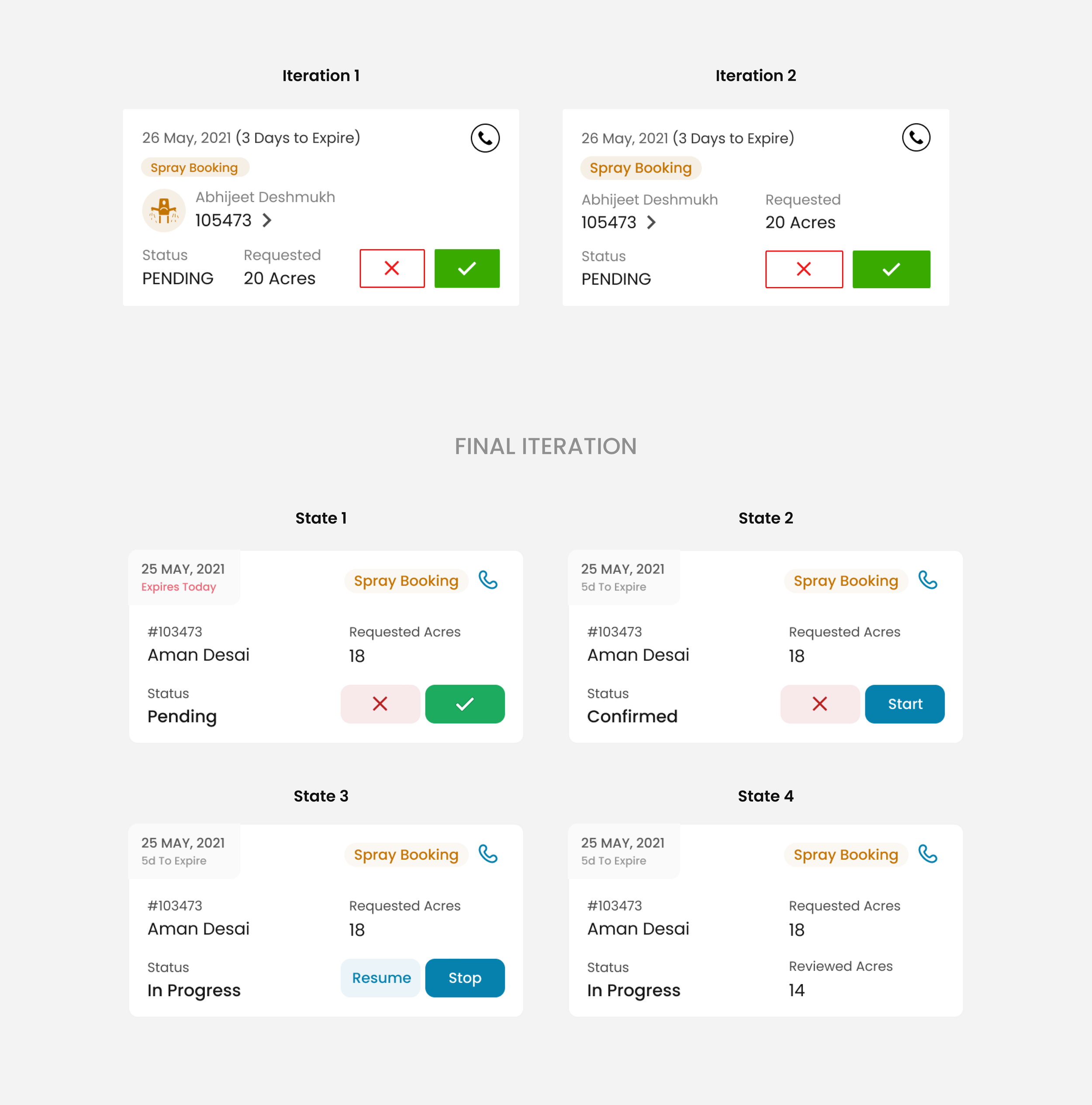
6. Old Design Analysis
Now compare this above knowledge obtained with the existing card design, user painpoints and analyse what works and what does not work on this current card design.
7. Design UI Iteratively
Iterate on new card design till all the above knowlege gathered is justified through simple, intutive and clean design :)
Conclusion
Meticulously following all the above steps resulted in positive and improved user experience for our operators.